When you’re raising ₹40 crore, investors don’t want vibes. They want numbers. Specifically, they want to see that your customers stick around, that you’re spending less to acquire them than they’re worth, and that your retention curves look like they’re headed somewhere north.
I built this cohort analysis system at EMB Global to answer exactly those questions. And to build visualizations that would survive investor scrutiny.
What is cohort analysis?
Think of a cohort as a group of customers who showed up in the same month. Cohort analysis is tracking how that group behaves over time. In month 1, maybe 100% of them are active. By month 6, maybe 40% are still coming back.
By tracking multiple cohorts across months, you see patterns: which acquisition channels (the ways customers find you: ads, search, word-of-mouth) bring stickier customers? Does retention improve if you launch a new feature in month 3? Are newer cohorts more or less valuable than older ones?
For a startup, this is the heartbeat. You’re not just watching total revenue. You’re watching whether the business itself is getting better or worse. Better retention curves, even with flat acquisition, mean you’re building something defensible.
Setting Up the Data
For this analysis, I used a synthetic dataset (fake but realistic data that mirrors real patterns) of 5,000 customers acquired over 24 months across 5 channels (organic, paid search, social, referral, and partnership). Each customer had transaction data showing when they showed up and what they spent. Here’s how I structured it:
import pandas as pd
import numpy as np

# Build a synthetic customer base to simulate real-world cohort data
# 5000 customers is enough to see meaningful retention patterns
np.random.seed(42)
n_customers = 5000

customers = pd.DataFrame({
    'customer_id': range(1, n_customers + 1),
    'acquisition_date': [start_date + timedelta(days=np.random.randint(0, 365))
                         for _ in range(n_customers)],
    'acquisition_channel': np.random.choice(
        ['Organic', 'Paid Search', 'Social Media', 'Referral', 'Direct'],
        n_customers, p=[0.25, 0.30, 0.20, 0.15, 0.10]),
    'acquisition_cost': np.random.uniform(500, 5000, n_customers).round(2)
})

customers['cohort_month'] = customers['acquisition_date'].dt.to_period('M')
What you get from this: a clean table with 5,000 customer records, each tagged with when they signed up, how they found the product, and what they paid. This is your raw material for everything that follows.
Building the Retention Matrix
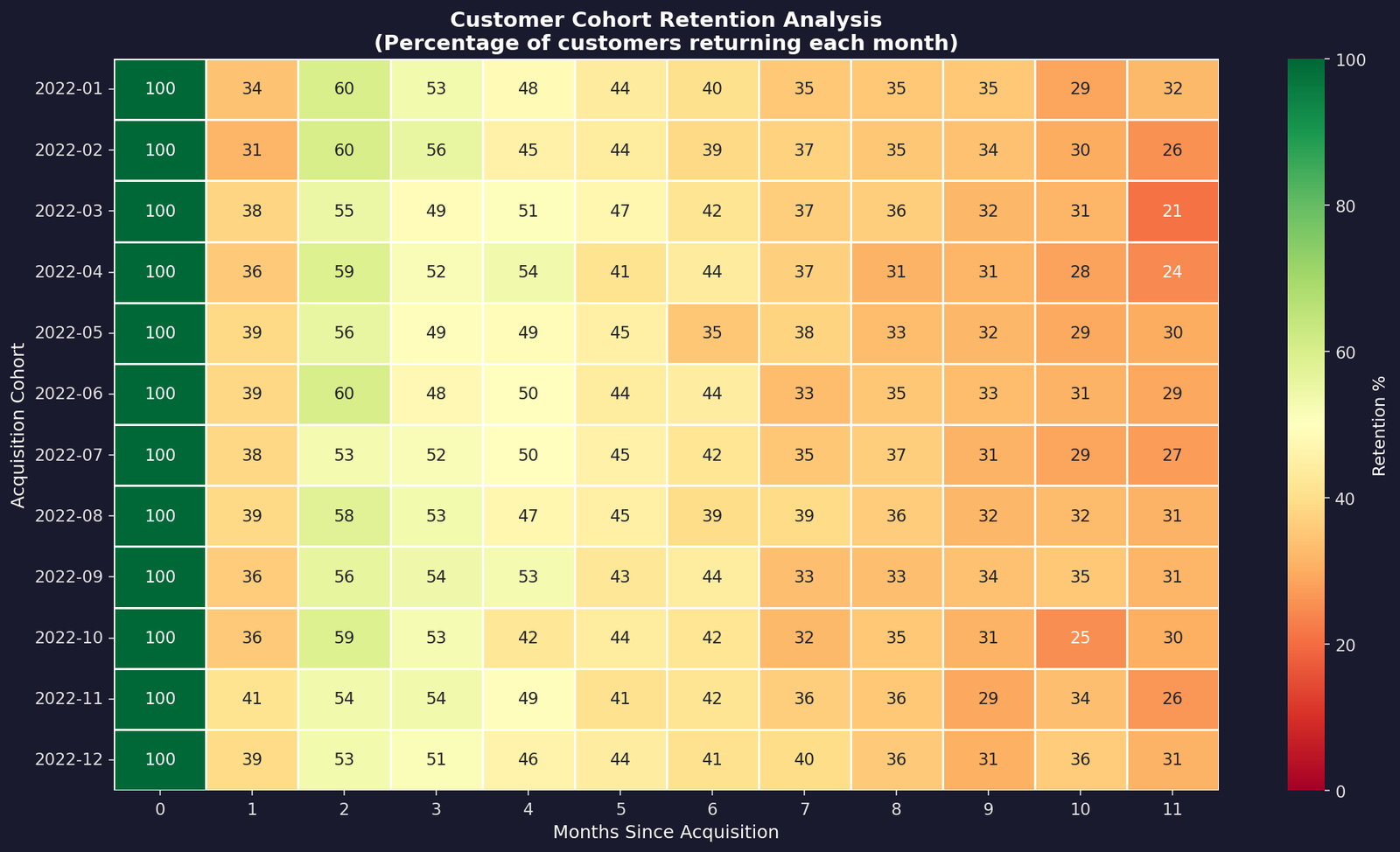
The retention matrix is the core of cohort analysis. For each cohort (acquisition month), I counted how many customers were active in each subsequent month. You end up with a grid where each row is a cohort and each column is a month since they signed up. Basically a heatmap that tells you the story of your business at a glance.
Here’s the core logic: merge transaction dates with acquisition dates, calculate the month offset, then pivot to create a cohort-by-month table. Colors shift from green to red as retention drops. The redder the cell, the more churn (customers dropping off).
# Connect each transaction to the customer's signup month
# so we know which "batch" (cohort) they belong to
df = transactions_df.merge(customers[['customer_id', 'cohort_month']], on='customer_id')
df['transaction_month'] = df['transaction_date'].dt.to_period('M')

# How many months after signup did this transaction happen?
df['cohort_index'] = (df['transaction_month'] - df['cohort_month']).apply(lambda x: x.n)

# Count unique customers active in each cohort x month combo
cohort_data = df.groupby(['cohort_month', 'cohort_index'])['customer_id'].nunique().reset_index()

# Pivot into a grid: rows = cohorts, columns = months since signup
cohort_matrix = cohort_data.pivot(index='cohort_month', columns='cohort_index', values='n_customers')

# Convert raw counts to percentages (relative to month 0)
retention_matrix = cohort_matrix.divide(cohort_matrix.iloc[:, 0], axis=0) * 100
The heatmap shows 12 cohorts tracked over 12 months. The brightest green cells (top-left) show near-complete retention at acquisition. By month 3, we’re at around 52% retention. By month 6, that drops to 41%.
The consistency across cohorts is actually good news. Newer cohorts aren’t churning faster than older ones, which means the product experience hasn’t degraded.
Unit Economics: LTV, CAC, and the Ratio That Matters
Unit economics is the simple math of how much you spend to get a customer versus how much they’re worth to you. Get this right and the business scales. Get it wrong and you’re just burning money faster.
Investors ask one question first: “What’s your LTV to CAC ratio?” Lifetime Value divided by Customer Acquisition Cost. If you’re spending ₹2,000 to acquire a customer who’s worth ₹50,000 over their lifetime, that’s a 25x return.
That’s a strong number. Below 3x? You’ve got a problem. Above 5x? You’re onto something.
# Sum up everything each customer ever spent — that's their lifetime value
customer_ltv = transactions_df.groupby('customer_id')['amount'].sum().reset_index()
customer_ltv.columns = ['customer_id', 'ltv']

# Combine LTV with acquisition data so we can compare
# what we spent to get them vs what they brought in
customer_metrics = customers.merge(customer_ltv, on='customer_id')
customer_metrics['ltv_cac_ratio'] = customer_metrics['ltv'] / customer_metrics['acquisition_cost']

# Break it down by channel to see which ones bring
# the most valuable customers relative to cost
channel_metrics = customer_metrics.groupby('acquisition_channel').agg({
    'ltv': 'mean', 'acquisition_cost': 'mean', 'ltv_cac_ratio': 'mean'
}).sort_values('ltv_cac_ratio', ascending=False)
The numbers: Average LTV: ₹47,216 | Average CAC: ₹2,745 | LTV:CAC Ratio: 24.1x. Referral brings the best economics at 24.2x. Lower acquisition cost, similar lifetime value.
Paid search is solid. Even the lowest-performing channel clears a healthy ratio. This is the kind of chart that makes investors lean forward.
The Retention Curve
If the heatmap shows the population, the retention curve shows the trajectory. By averaging retention across all cohorts, we get a single curve showing what an “average” customer looks like. Month 1 is always 100%. Then it drops to 52% by month 3, 41% by month 6, stabilizing around 15-20% by month 12.
That steep drop in months 1-3 is the signal. If you can improve retention in that window, with better onboarding, engagement campaigns, or just showing users value sooner, you massively improve LTV. A 10% lift in month 2 retention, compounded across 5,000 customers, is the difference between a Series A and a Series B story.
Revenue Over Time
Retention curves tell one story. Revenue curves tell another. Here I tracked cumulative revenue per cohort: how much each batch of customers generated over their lifecycle.
The shape of these curves matters. If they plateau early, your LTV ceiling is low. If they keep climbing, customers are spending more over time. If newer cohorts climb faster than older ones, your product is getting better at extracting value.
Each line is a cohort. The steepness in early months reflects high activity, while the flattening afterward reflects the retention drop. Newer cohorts grow faster initially, suggesting product improvements or better activation (getting users to their first “aha” moment faster). Basically a sign the product’s actually getting better over time.
Key Takeaways
- The first 3 months are make-or-break. If 48% of customers churn by month 3, you’re burning LTV. Fix this window and everything else compounds.
- Channel economics are consistently healthy. Referral and paid search outperform, but no channel is unprofitable. That consistency is rare and valuable.
- Newer cohorts aren’t worse. Retention curves are flat across time, meaning product quality hasn’t degraded. Many startups can’t say that.
- LTV:CAC of 24x means growth leverage. You can spend aggressively on acquisition because growth will be profitable. Investors see that too.
Want to run this on your own data? I’m releasing the full notebook soon. Plug in your numbers, get the same charts and metrics instantly. Got questions or want to nerd out about retention? Hit me up on LinkedIn.


Leave a Reply